Free design token and color system
Open token packs, accessible palettes, dashboard status colors, type systems, and CSS-ready visual helpers.
Move from scattered colors to a usable small design system with palette evidence, status states, and exportable token helpers.
Decision brief
Start
Preview the strongest pack first
Command Palette Component Kit shows the fastest visual proof for this path.
Do
Run the paired utility
Color Palette Generator handles the repetitive output step around this pack search.
Learn
Read the usage guide before downloading
Move download visitors into deeper tutorials, tool education, and related creator workflows.
Next
Continue into an adjacent search path
Free SaaS dashboard UI kit: Give a product builder a credible dashboard starting point with enough UI states, evidence, and tool pairings to keep moving.
PNGCSSJSONREADME
Workflow
- Choose palette or token packs
- Generate colors, contrast, and shadows
- Use guide paths for applying tokens across UI states
Useful tools
- Color Palette GeneratorGenerate a usable color palette from one base color with tints, shades, contrast text, and CSS variables.
- Contrast CheckerCheck foreground/background contrast ratio and get readable pass/fail guidance for UI copy.
- Shadow Token GeneratorCreate CSS shadow tokens for cards, modals, toolbars, and elevated UI states.
- Gradient CSS GeneratorGenerate a balanced CSS gradient, fallback color, and utility class from two or three colors.
- JSON FormatterFormat, minify, validate, and download JSON snippets for quick developer and automation work.
design token starter
figma color palette
css variables palette
accessible ui colors
dashboard status colors
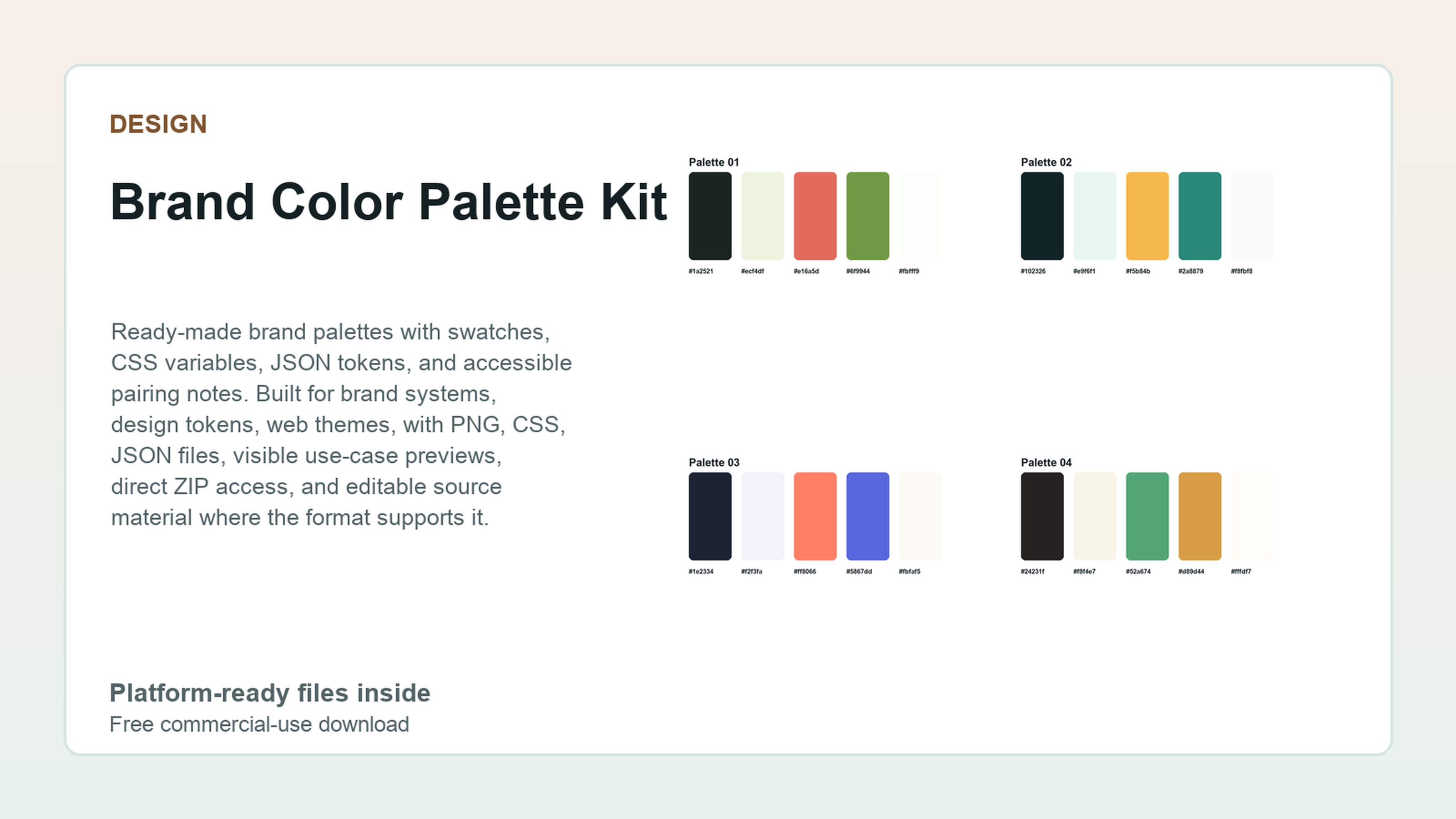 Design
Brand Color Palette Kit
67 files - High utility
Design
Brand Color Palette Kit
67 files - High utility
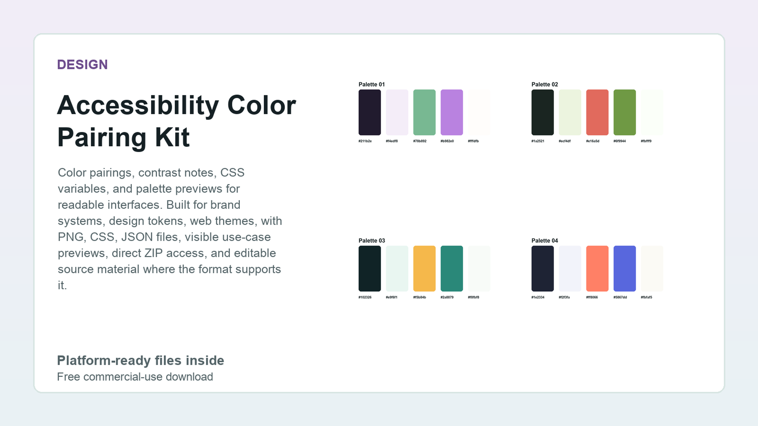 Design
Accessibility Color Pairing Kit
67 files - High utility
Design
Accessibility Color Pairing Kit
67 files - High utility
 Design
 Token Starter Kit
24 files - High utility
Design
Design Token Starter Kit
24 files - High utility
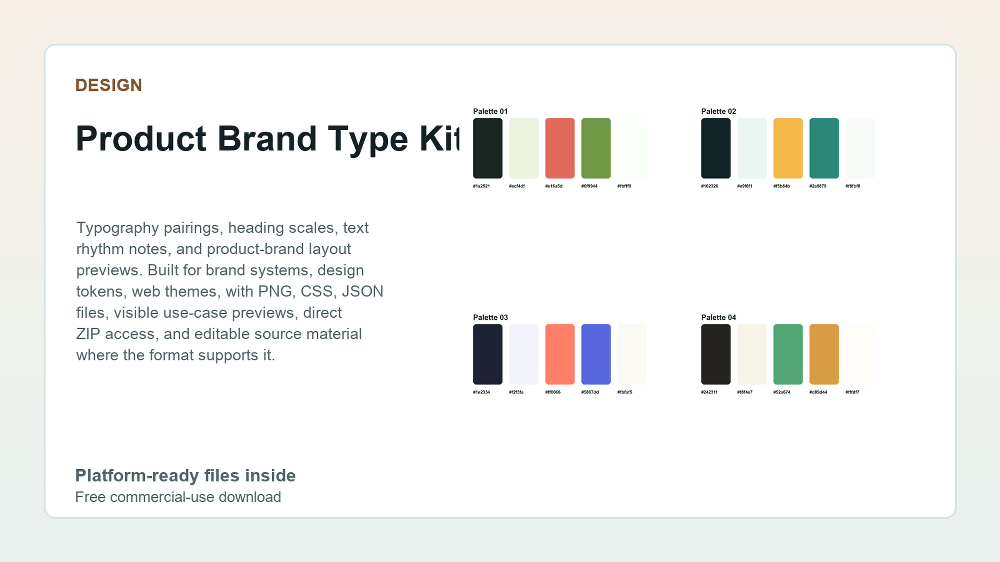 Design
Product Brand Type Kit
67 files - High utility
Design
Product Brand Type Kit
67 files - High utility
 Design
Landing Page Theme Token Kit
24 files - High utility
Design
Landing Page Theme Token Kit
24 files - High utility
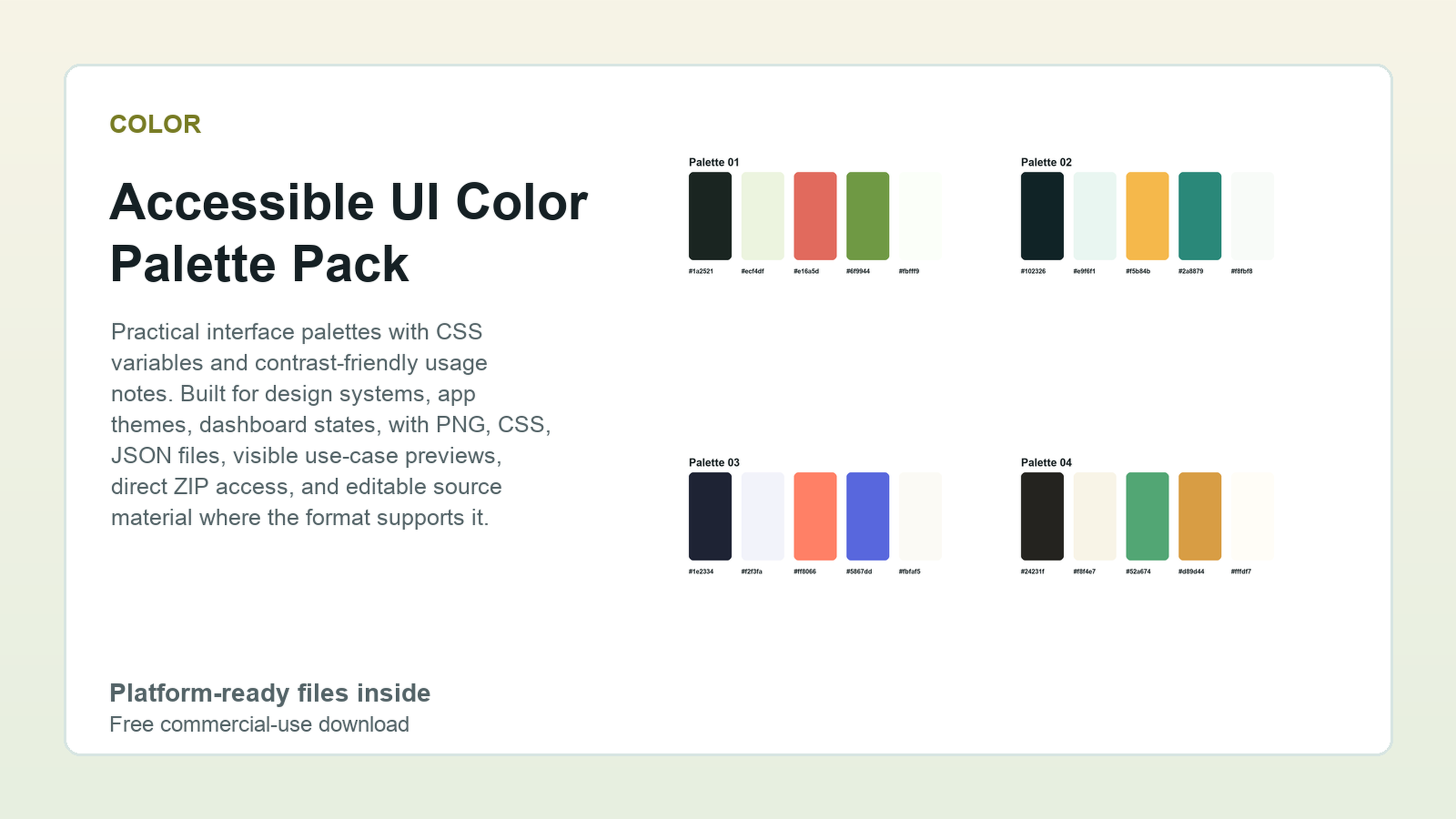 Color
Accessible UI Color Palette Pack
109 files - High
Color
Accessible UI Color Palette Pack
109 files - High
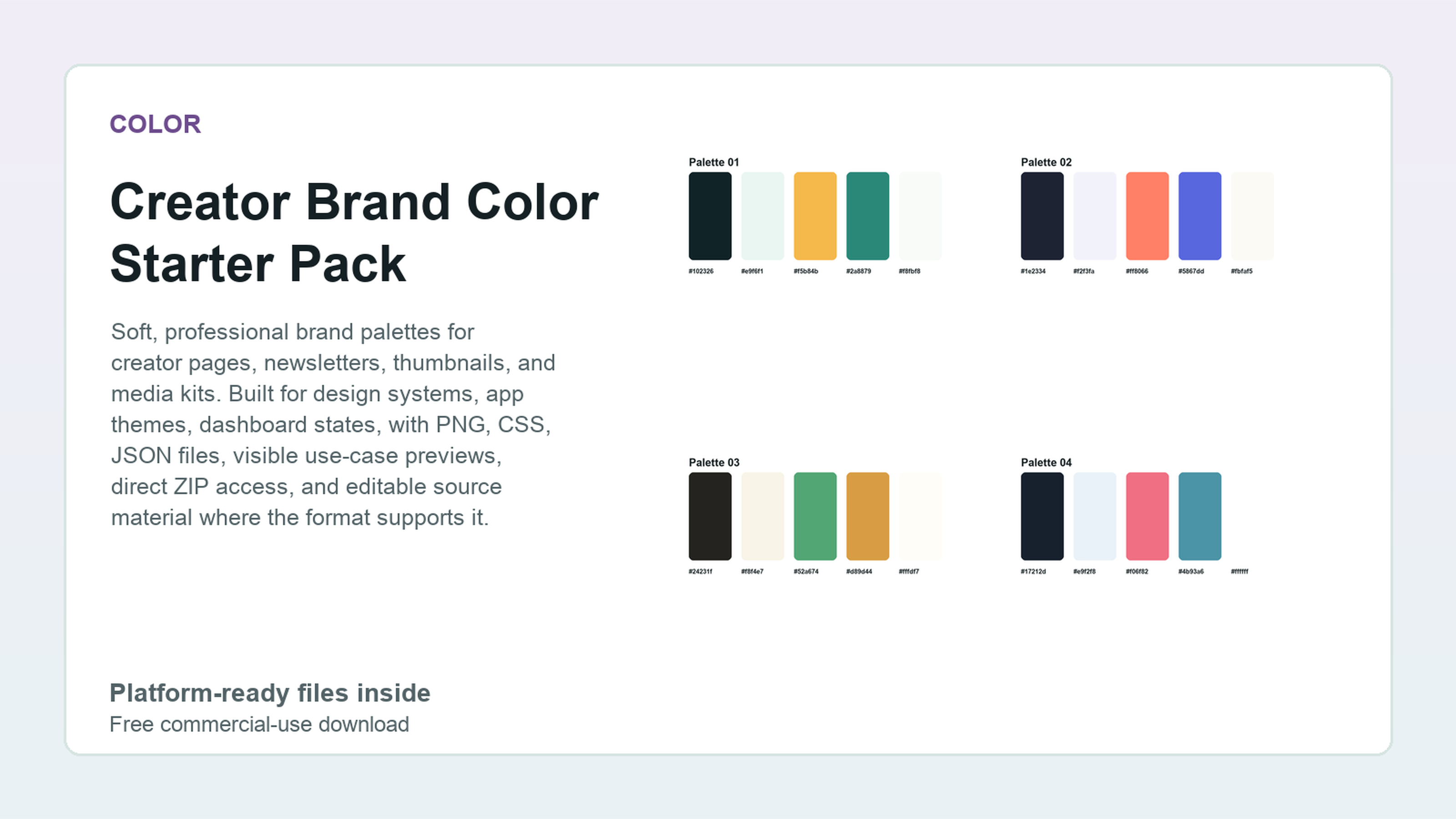 Color
Creator Brand Color Starter Pack
109 files - High
Color
Creator Brand Color Starter Pack
109 files - High
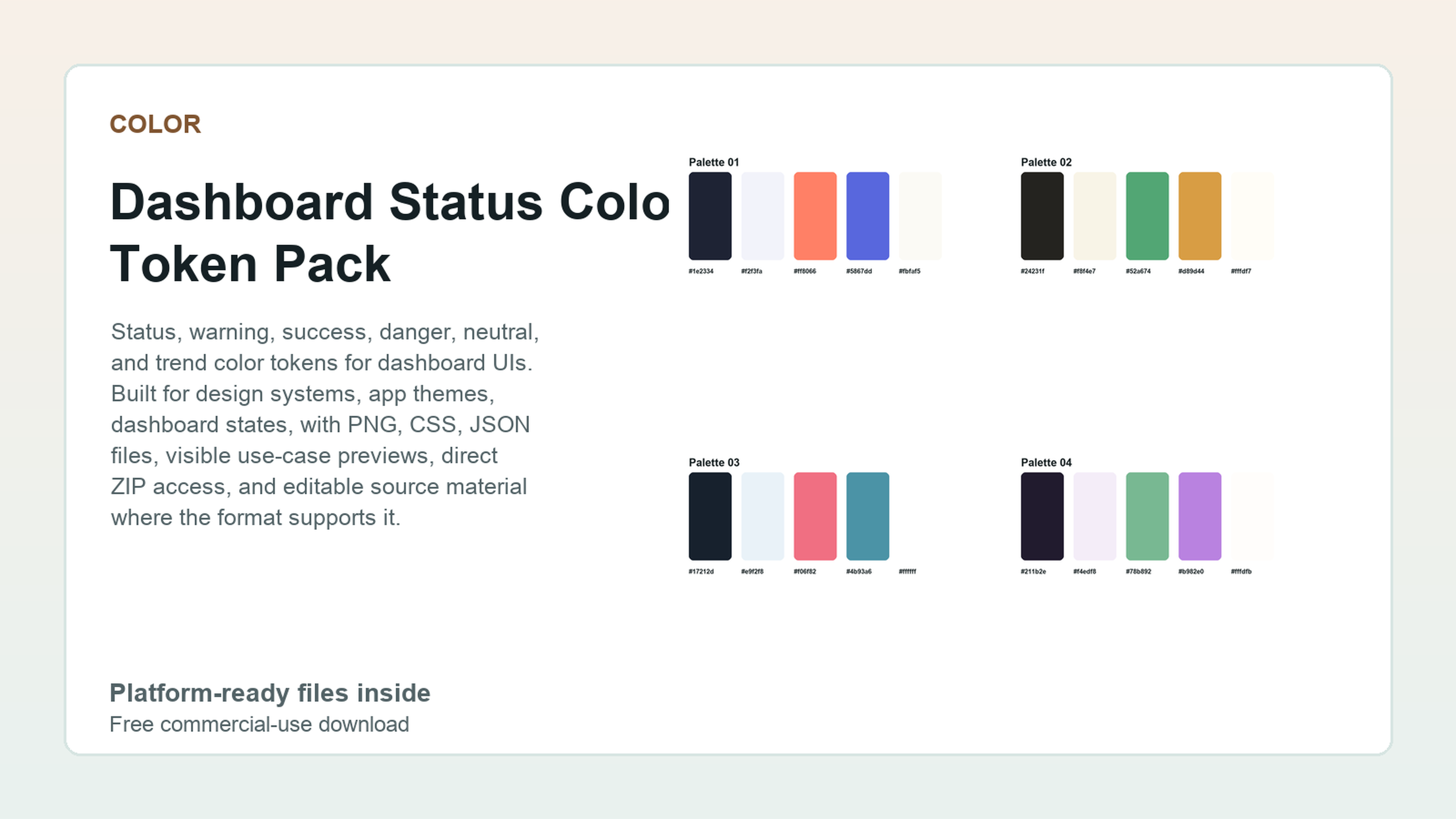 Color
Dashboard Status Color Token Pack
109 files - High
Color
Dashboard Status Color Token Pack
109 files - High
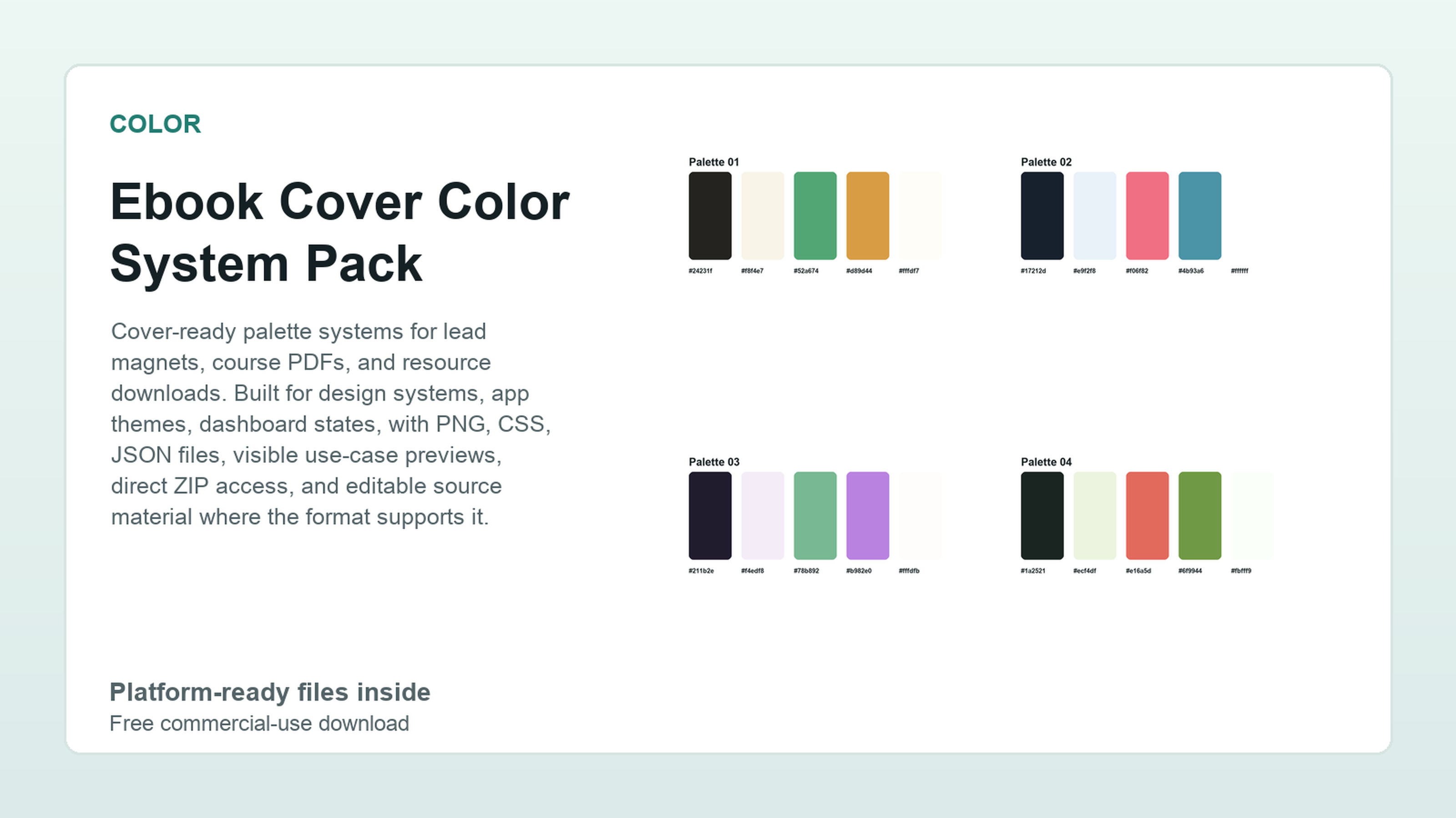 Color
Ebook Cover Color System Pack
109 files - High
Color
Ebook Cover Color System Pack
109 files - High
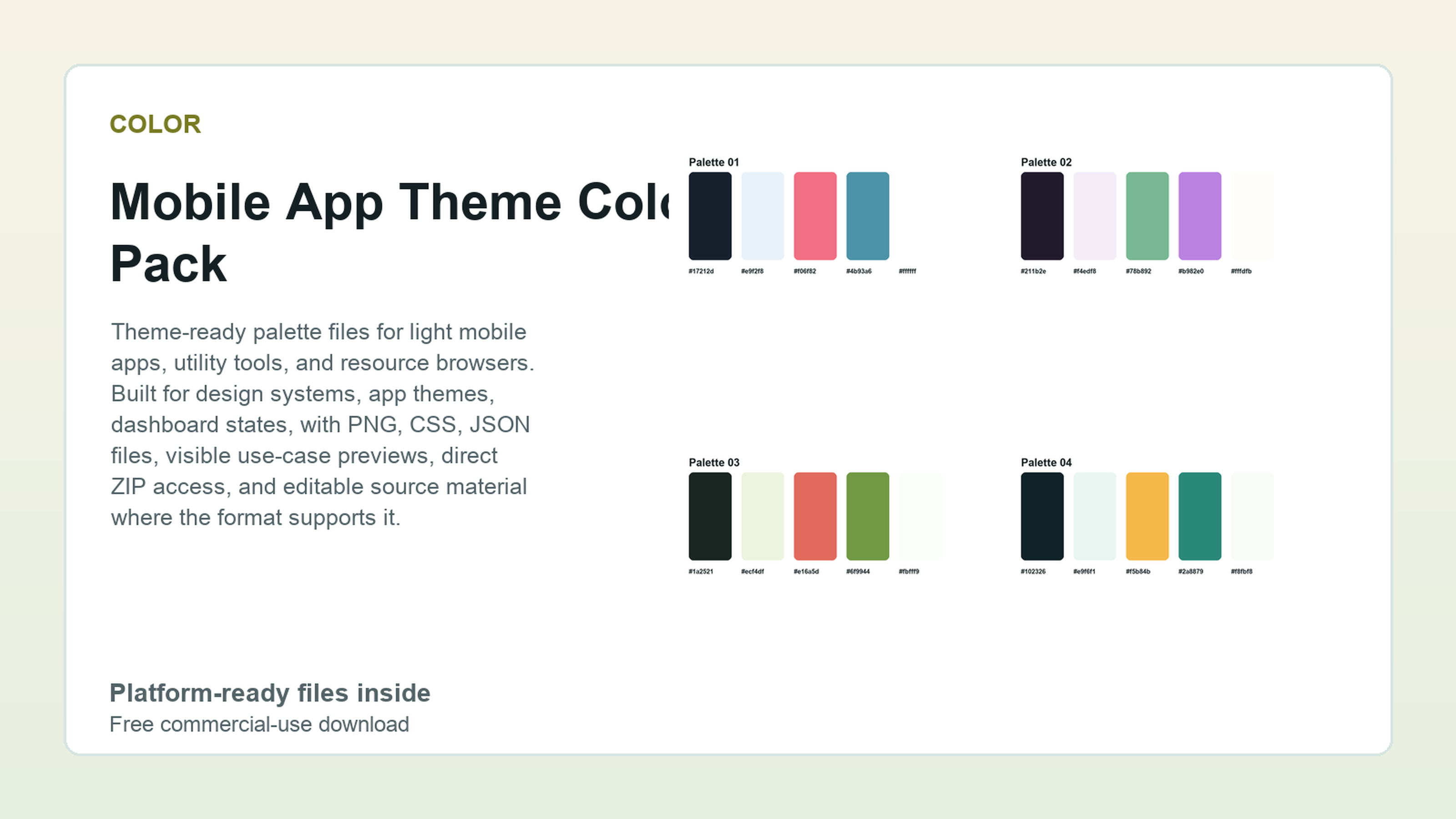 Color
Mobile App Theme Color Pack
109 files - High
Color
Mobile App Theme Color Pack
109 files - High
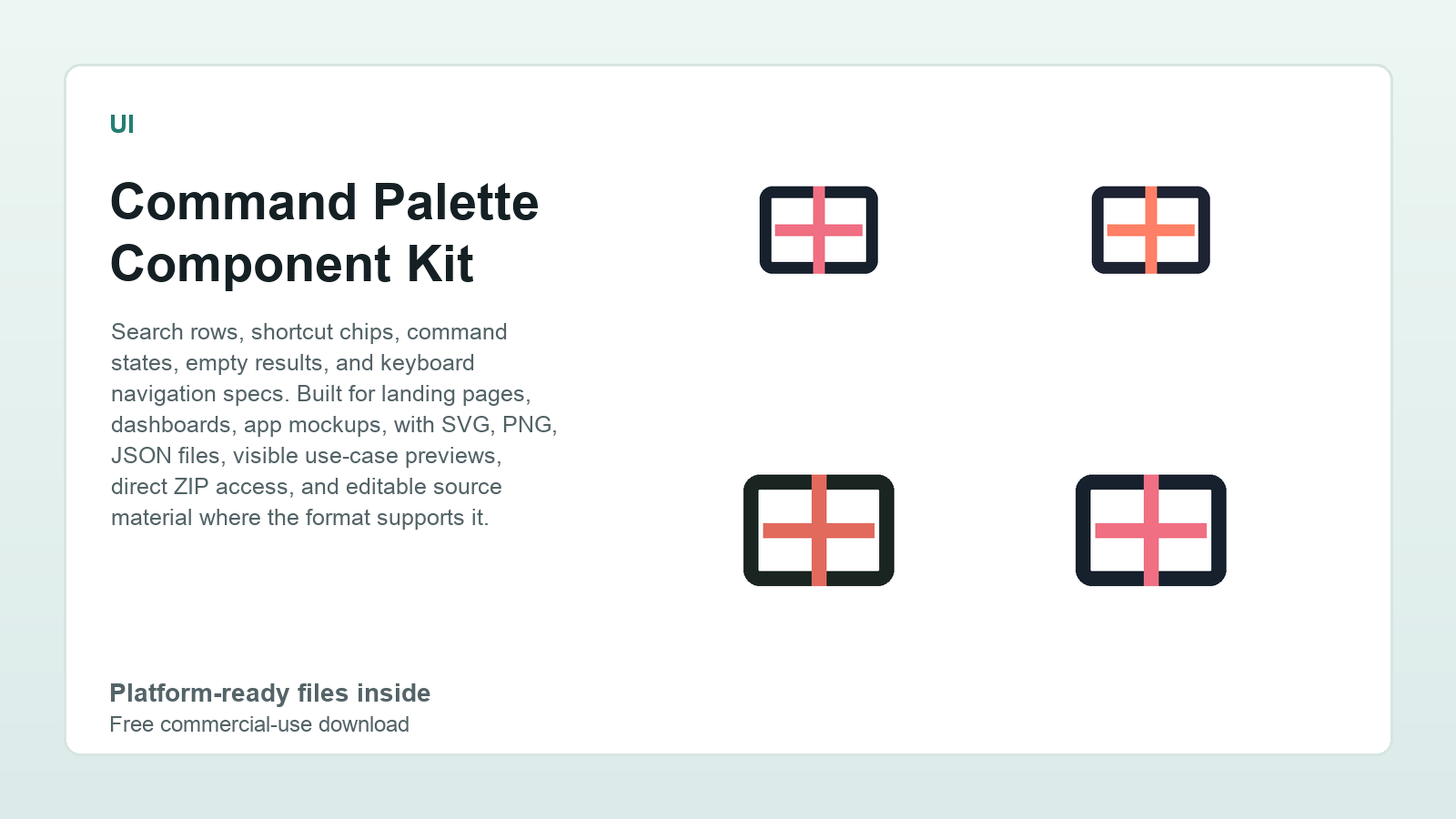 UI
Command Palette Component Kit
199 files - High
UI
Command Palette Component Kit
199 files - High
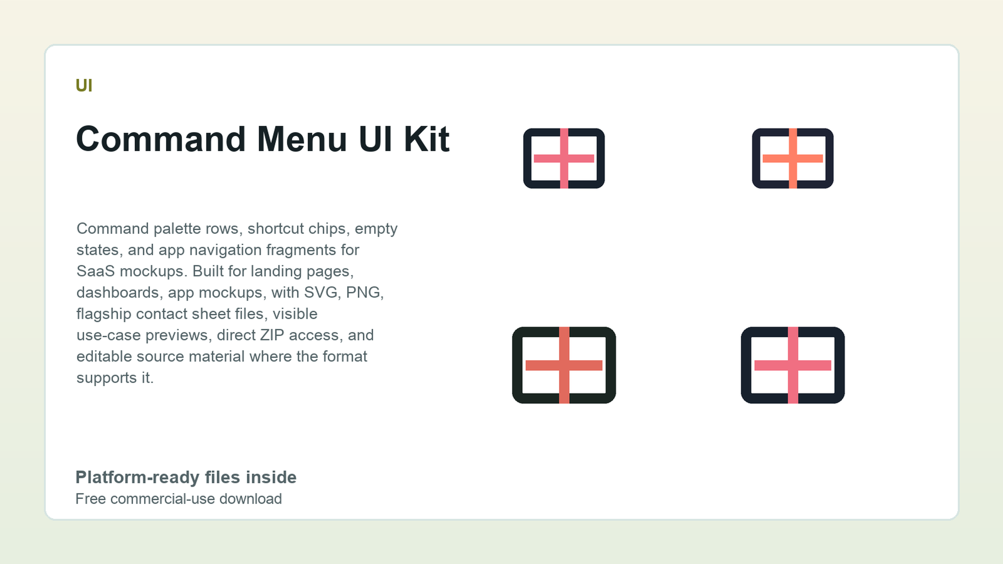 UI
Command Menu UI Kit
167 files - High
UI
Command Menu UI Kit
167 files - High
Related search paths
UI
Free SaaS dashboard UI kit
Give a product builder a credible dashboard starting point with enough UI states, evidence, and tool pairings to keep moving.
Web
Free Figma landing page kit
Move from a blank landing-page idea to sections, visual proof, copy, colors, and export decisions without starting from an empty canvas.
UI
Free Figma UI starter kit
Move from a blank product idea to UI states, tokens, dashboard screens, and implementation notes in one browsing path.
Motion
Free motion and Lottie animation kit
Give UI and video work small motion pieces that are visible before download and easier to hand off than loose animation experiments.
Mockups
Free app screenshot mockups
Turn a raw app screen into launch visuals, store mockups, and onboarding scenes with usable companion tools nearby.